- Let’s get into the fascinating world of colour psychology in interior design. In this concise 10-page ebook, we’ll explore how different colours impact our emotions, behaviour, and overall well-being within our living spaces.
- Colour Psychology in Interior Design
- 1. Introduction
- Colour plays an indispensable role in shaping the atmosphere and energy within a living space. The careful choice of paint colours for your home’s interior not only enhances its visual appeal but also significantly impacts your mood, well-being, and daily experiences within the space.
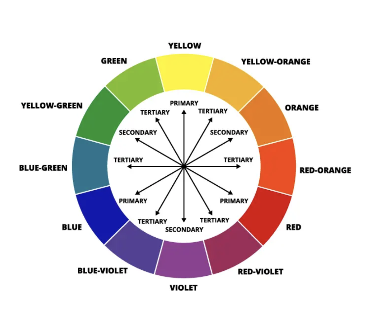
- 2. Understanding Colour Psychology
- Colour psychology is a theory that examines how each colour affects a person’s mood, cognitive functions, creativity, and productivity. When surrounded by calming hues such as blue or green, individuals feel relaxed. Conversely, vibrant tones like red, maroon, or orange evoke energy and passion. Neutral colours such as white or grey create a serene ambiance.
- 3. Role of Different Colours
- Let’s explore the psychological effects of various colours commonly used in interior design:
- a. Blue
- Ideal for: Bedrooms, bathrooms, and meditation spaces.
- Calming: **Psychological Background:Blue is often associated with the sky and the sea, which are inherently calming and expansive. Psychologically, it is known to promote feelings of peace, trust, and security. Blue has been shown to have a calming effect on the mind, reducing stress levels and promoting relaxation. It is also linked to increased productivity and concentration, making it an excellent choice for workspaces and areas where focus is required.
- b. Green
- Ideal for: Living rooms, kitchens, and home offices.
- Harmonious:**Psychological Background:** Green is the colour of nature, representing growth, renewal, and harmony. Psychologically, it is believed to have a balancing effect on the emotions, promoting feelings of stability, balance, and vitality. Green is often associated with feelings of freshness, rejuvenation, and health, making it an ideal choice for spaces where you want to foster a sense of well-being and connection with the natural world.
- c. Red
- Ideal for: Dining areas and accent walls.
- Energetic: **Psychological Background:** Red is a highly stimulating colour that is associated with energy, passion, and intensity. Psychologically, it is known to increase heart rate and blood pressure, activating the body’s fight-or-flight response. Red is often used to evoke strong emotions and create a sense of urgency or excitement. It can also stimulate appetite and encourage social interaction, making it a popular choice for dining areas and social spaces.
- d. Yellow
- Ideal for: Kitchens, playrooms, and entryways.
- Cheerful: **Psychological Background:** Yellow is the colour of sunshine, representing warmth, optimism, and happiness. Psychologically, it is known to uplift spirits and evoke feelings of joy, positivity, and energy. Yellow is often associated with creativity and intellect, stimulating mental activity and promoting a sense of optimism and confidence. It can also have a warming effect on the body and mind, making it an excellent choice for spaces where you want to create a sense of brightness and cheerfulness.
- e. Grey
- Ideal for: Any room, especially when paired with vibrant accents.
- Sophisticated: **Psychological Background:** Grey is a neutral colour that is often associated with stability, sophistication, and balance. Psychologically, it is believed to have a calming effect on the emotions, promoting feelings of composure, serenity, and introspection. Grey is also associated with practicality and reliability, making it a popular choice for minimalist and contemporary designs. It can provide a sense of grounding and stability in a space, allowing other colours and elements to stand out.
- f. Purple
- Ideal for: Bedrooms and cozy reading nooks.
- Regal: **Psychological Background:** Purple has long been associated with royalty, luxury, and spirituality. Psychologically, it is known to stimulate the imagination and encourage creativity. Purple is often associated with introspection, intuition, and mysticism, making it a popular choice for spaces where you want to create a sense of luxury and sophistication. It can also promote feelings of relaxation and tranquility, making it an excellent choice for bedrooms and meditation rooms.
- g. Orange
- Ideal for: Home gyms and creative spaces.
- Invigorating: **Psychological Background:** Orange is a vibrant and energetic colour that is associated with enthusiasm, creativity, and warmth. Psychologically, it is known to stimulate the senses and evoke feelings of excitement, motivation, and vitality. Orange is often associated with optimism and adventure, encouraging risk-taking and exploration. It can also stimulate appetite and promote social interaction, making it a popular choice for kitchens, dining areas, and social spaces.
- h. Brown
- Ideal for: Earthy-themed rooms and rustic decor.
- Grounding: **Psychological Background:** Brown is the colour of the earth, representing stability, security, and comfort. Psychologically, it is known to evoke feelings of warmth, safety, and reassurance. Brown is often associated with reliability and resilience, making it a popular choice for grounding and anchoring a space. It can also create a sense of coziness and intimacy, making it an excellent choice for creating inviting and welcoming environments.
- 4. Practical Tips
- Balance: Use a mix of warm and cool colours to create harmony.
- Accent Walls: Experiment with bold colours on a single wall.
- Personalization: Consider your personality and preferences when choosing colours.
- 5. Conclusion
- Remember that colour is a powerful tool in interior design. Keep in mind that that colour psychology will influence every space, no matter if you try to create a relaxing space or a living or work space. The knowledge about colour psychology will help you make informed choices
- Understanding the Influence of Color in Design
- The Impact of Color Psychology in Interior Design
- Exploring Color Psychology in Interior Design
- Color psychology in interior design delves into how colour selections can shape our emotions, behaviours, and overall ambiance within a space. This study empowers designers to craft environments that evoke specific emotional responses, enriching both the functionality and visual appeal of diverse rooms.
- The Significance of Colours in Interior Design
- Colours wield considerable influence over the atmosphere and mood of a space. While warm tones such as red, orange, and yellow invigorate and inspire, cooler hues like blue, green, and purple instils calmness and tranquility. Meanwhile, neutral shades offer versatility, fostering a sense of elegance and timelessness.
- Selecting the Perfect Palette for Your Space
- Choosing the right colours involves thoughtful consideration of the room’s purpose, lighting conditions, and desired mood. Employing colour schemes such as monochromatic or complementary can establish visual harmony, while aligning colour choices with their psychological effects and intended ambiance is paramount. Additionally, accounting for natural and artificial lighting ensures colours maintain their intended impact.
- Color’s Role in Shaping Mood
- Colours possess the ability to profoundly influence the mood of a space. For instance, serene blues in a bedroom promote relaxation and restful sleep, while vibrant reds in a kitchen can stimulate appetite and encourage lively conversation. Aligning colour selections with desired activities and atmospheres is essential for creating harmonious interiors.
- The Importance of Color Psychology in Design
- Understanding colour psychology is vital as it directly impacts people’s emotions and behaviours within a space. Thoughtfully chosen colours have the potential to uplift mood, enhance productivity, and even improve physical well-being. Conversely, inappropriate colour choices may lead to discomfort or agitation among occupants.
- The Contemporary Application of Color in Design
- Today, colour serves not only as an aesthetic element but also as a tool to manipulate spatial perception, convey brand identity in commercial settings, and promote occupant well-being. Designers prioritize staying abreast of colour trends and adopting sustainable and psychologically beneficial colour palettes in their projects.
- The Influence of Lighting on Color Perception
- Lighting plays a crucial role in how colours are perceived within a room. Natural light accurately showcases hues, while artificial lighting can alter colour tones and intensity. Understanding the nuances of lighting conditions is essential for selecting colours that maintain their desired appearance across different settings.
- Colour’s Impact on Productivity and Well-Being
- Room colours have a profound effect on productivity and well-being. For instance, calming blues enhance focus and concentration, making them ideal for office or study spaces. Meanwhile, greens can alleviate eye strain and promote a sense of balance, contributing to overall comfort and wellness.
- Utilizing Color Psychology to Shape Atmosphere
- To create a desired atmosphere using colour psychology, begin by identifying the desired mood. Choose colours accordingly: warm tones for a welcoming ambiance, cool shades for serenity, or neutrals for balance. Implement these colours strategically through paint, furnishings, and decor to shape the desired atmosphere.
- Guidelines for Color Use in Different Rooms
- While no strict rules exist, there are established practices based on common emotional responses to colours. For instance, calming blues and greens are often favoured for bedrooms, while vibrant reds and oranges may be chosen for dining areas. Ultimately, personal preference and the room’s function should inform colour selection.
- Feel free to explore further, and happy decorating!
Published by Urs
Styling and Staging your Home.
View all posts by Urs